Elevation
How surfaces and shadows work together to create visual depth and hierarchy
Screens are flat, but interfaces need depth. Without visual cues, every element sits on the same plane and users have to rely on position alone to understand what belongs together, what is interactive, and what is temporary. Elevation solves this by creating the illusion of layers: a card feels like it sits above the page, a dialog floats above everything else, and an input has a clear boundary against the surface it lives on.
This matters because it directly guides attention. A raised card groups related content and separates it from the surrounding page. A floating menu signals that it is temporary and will go away. A subtle border on an input tells users where they can type. Without these depth cues, interfaces feel flat and ambiguous.
Three signals work together to produce this effect:
- Background layers set the color of each level.
- Boundaries (borders) encode what kind of element something is.
- Fill and shading stand raised controls off the page without a shadow.
Nothing in normal document flow casts a shadow. A card separates from the page by sitting on the gray page background, not by a shadow beneath it. A button is a raised cap whose own shading is the lift. A field is a flat well. The one shadow left in the system marks the one thing shadows are actually for: a surface that has left the page and floats above it.
Do I need to apply elevation manually?
Marigold components like <Card>, <Dialog>, and <Menu> already apply the correct background, border, and shadow tokens internally. You only need the utility classes described on this page (ui-surface, ui-control, ui-soft, shadow-elevation-overlay, bg-background, etc.) when building custom elements that aren't covered by an existing component.
Background layers
Before shadows come into play, background colors establish the base layers of the interface. Three tokens define where content sits:
| Token | Value | Use for | |
|---|---|---|---|
backgroundvar(--color-background) | charcoal-100 | Page base layer, the gray canvas behind everything | |
surfacevar(--color-surface) | white | Content surface for cards, inputs, and panels | |
mutedvar(--color-muted) | charcoal-50 | Subtle tint to set areas apart within a surface |
bg-background and bg-surface work as a pair: the page background provides contrast so that white surfaces stand out. bg-muted adds a gentle tint within a surface to distinguish secondary content without adding another elevation level.
Surfaces and controls
Every elevated element in Marigold belongs to one of two families:
- Surfaces structure the page: cards, panels, and overlays that group, separate, and contain content.
- Controls are operated. Buttons, form fields, segmented controls, and calendars are all things the user manipulates to enter data or trigger an action.
Interactivity is not what separates them. Controls are always interactive, but a surface can be interactive too. A selectable card is still a surface. The question is the element's role. Does it contain content, or does the user operate it?
The families are told apart by their boundary, not by a shadow. Nothing in normal flow casts one anymore:
- Surfaces wear
ui-surface: a quiet hairline that hints at a section's edge without adding noise. - Fields wear
ui-control: a clearly visible boundary that makes the element stand off the page as something to operate. It is a flat well, not a shadow. - Button-like controls skip the boundary altogether and wear a raised cap instead:
ui-softfor the light, neutral cap (secondary Button, Menu trigger) andui-contrastfor the dark, bold cap (primary Button, ActionBar). The cap's own gradient and edge are the lift, so it needs neither a separate boundary nor a shadow.
<!-- a surface for structure, flat in normal flow -->
<div class="ui-surface">...</div>

<!-- a control, clearly bounded, and just as flat -->
<div class="ui-control">...</div>
ui-surface and ui-control are built on one primitive. ui-frame draws the shared fill, radius, and 1px rim that every raised element needs. The two utilities are siblings of that frame, differing only in which boundary token the rim wears (the quiet surface-border versus the denser control-border). Neither is a special case of the other. A control is not a kind of surface, it is the operable sibling. ui-soft and ui-contrast sit outside this primitive entirely. Caps draw their own ring, glint, and fill gradient, because the lift is the whole point of the recipe.
Two consequences of the rule:
- The border is the sole operability cue for fields. There's no shadow to lean on anymore, so a selected
<ToggleButton>or a segment inside a group still has to read as a control through its boundary and fill alone. - The boundary is required only where it is the sole cue. A ghost button carries its affordance through its label and hover state, so it draws no border. A
<ListBox>inside a<Popover>draws no boundary of its own, because the overlay frame already provides the surface. The requirement is on the system, not on every element in isolation.
Do
Give operable elements their boundary or cap: ui-control for custom
fields and pickers, ui-soft/ui-contrast for button-like elements.
Don't
Don't put ui-control on cards, panels, or other containers, because a
heavy edge on a surface reads as something to click.
The overlay shadow
The system keeps a single shadow tier. A button is modeled as a raised cap whose own shading is the lift: ui-soft for the light, neutral cap (secondary Button, Menu trigger) and ui-contrast for the dark, bold cap (primary Button, ActionBar). A field is a flat well built from ui-control, no shadow attached. A card or panel separates from the page by fill: a white surface sits on the gray page background, traced by a quiet decorative rim, not lifted by a shadow.
That leaves shadows with exactly one job: mark a surface that has left the page and floats above it.
| Token | Use for | Components |
|---|---|---|
shadow-elevation-overlay | Floating elements | Dialog, Drawer, Menu, Popover, Toast, ActionBar |
This diagram shows the model end to end: the page background (bg-background) is the base, a flat card separates from it by fill alone, flat controls and raised caps sit inside, and a floating panel (shadow-elevation-overlay) is the one layer that casts a shadow.
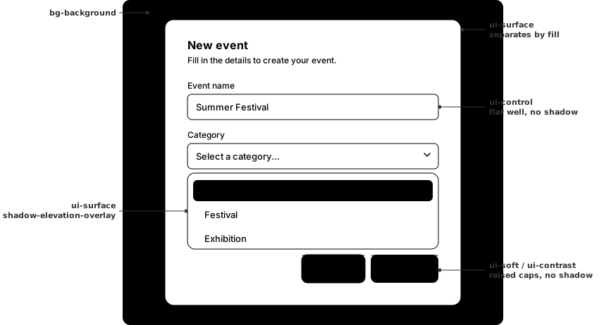
Overlay elevation is reserved for elements that temporarily float above the page. Dialogs, drawers, menus, popovers, toasts, and the action bar use it. Unlike surfaces in flow, overlays can stack on top of one another: a confirmation dialog over a menu, or a tooltip inside a drawer. They are always dismissible and often paired with a backdrop that dims the content underneath.
Click the button below to trigger a toast and see the overlay shadow in action.
import { Button, ToastProvider, useToast } from '@marigold/components';export default () => { const { addToast } = useToast(); return ( <> <ToastProvider position="bottom-right" /> <Button variant="secondary" onPress={() => addToast({ title: 'Event published', description: 'Summer Festival is now live.', variant: 'success', }) } > Show Toast </Button> </> );};<div class="ui-surface shadow-elevation-overlay">...</div>Do
Use overlay elevation for temporary, dismissible elements that the user can close or navigate away from.
Don't
Don't reach for a shadow anywhere else. Cards, panels, and controls separate from the page by fill and boundary, never by casting one.