App Frame
A composition pattern for building the application frame with persistent sidebar navigation, a top bar, and scrollable content.
Most business applications share a common frame: a sidebar for navigation, a top bar for context and actions, and a scrollable content area. The App Frame pattern shows how to compose this frame using <AppShell>, <Page>, and <Page.Header>, covering content placement decisions, the heading outline, action hierarchy, and responsive strategy.
Looking for the component API?
For props, slot details, and accessibility, see the AppShell and Page (including Page.Header) component pages.
Structure
The app frame divides the screen into three areas. The diagram below shows how they are arranged, and the code snippet shows how the components map to each area.
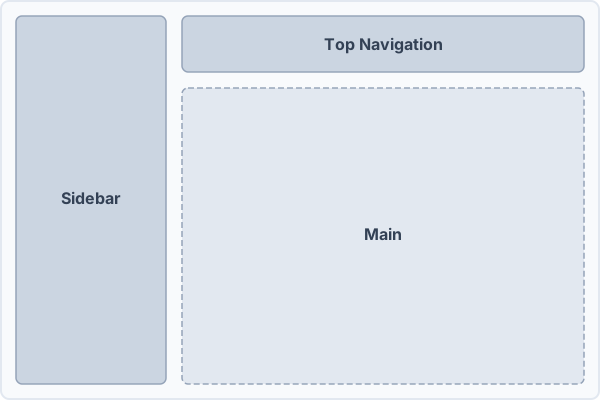
- Sidebar: Sits on the left and spans the full height. It holds the application logo, primary navigation links, grouped sections, and an optional footer. Users can collapse or expand it with a toggle button.
- Top Navigation: Stretches across the top next to the sidebar. It should provide the sidebar toggle, breadcrumbs for orientation, and user-related controls such as account menus or status indicators.
- Page: Takes up the remaining space. This is the scrollable content area. Wrap it in a
<Page>, which renders themainlandmark and owns the page's padding and rhythm. A page is a<Page.Header>followed by<Panel>s.
RouterProvider handles page navigation and AppShell positions everything on a CSS Grid. AppShell manages the sidebar's open/collapsed state internally (via defaultSidebarOpen), so the toggle in the header and the sidebar share state with no provider boilerplate.
<RouterProvider navigate={navigate}>
  <AppShell defaultSidebarOpen>
    <Sidebar>
      <Sidebar.Header>...</Sidebar.Header>
      <Sidebar.Nav>...</Sidebar.Nav>
      <Sidebar.Footer>...</Sidebar.Footer>
    </Sidebar>
    <TopNavigation>
      <TopNavigation.Start>
        <Sidebar.Toggle />
      </TopNavigation.Start>
      <TopNavigation.Middle>...</TopNavigation.Middle>
      <TopNavigation.End>...</TopNavigation.End>
    </TopNavigation>
    <Page>
      <Page.Header>
        <Title>Billing</Title>
        <Description>Manage your plan and invoices.</Description>
        <Button variant="primary">Upgrade plan</Button>
      </Page.Header>
      <Panel>...</Panel>
      <Panel>...</Panel>
    </Page>
  </AppShell>
</RouterProvider>
The order of <Sidebar>, <TopNavigation>, and <Page> inside AppShell doesn't matter since the grid template handles positioning. For controlled sidebar state, render your own <Sidebar.Provider> around <AppShell>. See the AppShell docs.
Where things go
Each area has a clear purpose. Mixing responsibilities between them makes the layout harder to use and harder to maintain.
- Logo placement: Put the application logo or name in the sidebar header, not in the top navigation. The sidebar is the persistent brand anchor. The top navigation is for orientation and utility actions.
- Primary navigation: All section-level links belong in the sidebar. Use groups (
<Sidebar.GroupLabel>) and separators (<Sidebar.Separator>) to organize them. See the Sidebar docs for drill-down navigation and detail page patterns. - Top navigation: The top navigation exists primarily for breadcrumbs and search. Breadcrumbs go in the middle slot to show users where they are in the hierarchy. A search field can replace or complement them when global search is a core workflow. Don't place tabs, links, or secondary navigation here. That's what the sidebar is for. See the TopNavigation docs for further information.
- Breadcrumbs, not in the page header: Breadcrumbs describe where a page sits in the app, so they belong to the frame (which persists across navigation) rather than to
<Page.Header>, which describes the page itself. This is why Marigold places them in<TopNavigation>rather than the page header, unlike systems that fold breadcrumbs into the page title block. - Utility actions (top navigation, right side): The end of the top navigation is reserved for user-facing utilities like account menus, notification badges, or status indicators. Keep it concise. Too many items cause the navigation to overflow on smaller screens.
Do
- Place the logo in the sidebar header.
Use breadcrumbs in the top navigation middle slot for page context.
- Keep header content concise so it adapts to different widths.
- Use the sidebar exclusively for navigation links and groups.
Don't
Don't place tabs or secondary navigation in the header middle slot.
Don't overload the top navigation with elements that cause horizontal scrolling.
Don't put action buttons, forms, or unrelated content in the sidebar.
Landmarks
Each app frame slot renders semantic HTML, so the screen reader's landmark list reflects the layout automatically.
| Slot | Landmark |
|---|---|
<TopNavigation> | banner |
<Sidebar> | complementary |
<Sidebar.Nav> | navigation |
<Page> | main |
The <main> landmark is labelled by the page <h1> from <Page.Header>, so screen-reader landmark navigation announces the page by its title. When you compose multiple navigation regions inside the header (e.g. <TopNavigation.Middle> plus <TopNavigation.End>), give each a distinct aria-label so they can be told apart. Each <Panel> inside <Page> adds its own region landmark, labelled by its title.
F6 / Shift + F6 cycling is opt-in via the useLandmark hook. Today only <Drawer> opts in by default. Wrap the slots above (or any custom region) with useLandmark to add them to the cycle. See the Landmarks foundation for details.
Responsive behavior
<AppShell> always renders the L-shape grid and doesn't change at breakpoints. Responsive behavior comes from the components inside it. The sidebar collapses on desktop and becomes a modal sheet on mobile. The top navigation adapts its content at smaller widths. See the Sidebar and TopNavigation docs for details.
Page structure
Inside <Page>, lead with a <Page.Header> and follow it with the page's <Panel>s. <Page> supplies the vertical rhythm between them, so you don't wrap them in a <Stack> or <Inset>. When the rhythm between sections should differ from the header-to-content gap, wrap the sections in an optional <Page.Content> and set its space (see the Page docs).
<Page>
  <Page.Header>
    <Title>Billing</Title>
    <Description>Manage your plan and invoices.</Description>
    <Button variant="primary">Upgrade plan</Button>
  </Page.Header>
  <Panel>...</Panel>
  <Panel>...</Panel>
</Page>
The heading outline falls out of the defaults, with no per-component configuration:
| Element | Heading |
|---|---|
<Title> in <Page.Header> | h1 |
<Title> in <Panel.Header> | h2 |
<Title> in <Panel.Collapsible> | h3 |
<Page> does not enforce a max-width. For form-style pages, constrain width per surface with <Panel size="form"> rather than wrapping the whole page.
Common page layouts
Most application pages fall into a handful of shapes. Each is built from the same <Page> + <Panel> primitives. What differs is how many surfaces there are, how they are arranged, and how wide they run.
| Page | What it is | Recipe | Example |
|---|---|---|---|
| List / index | Browse and filter a collection before drilling in | A single full-width <Panel> wrapping a toolbar, filters, and a table | Venues |
| Detail / record | One object, with status and metadata | <Columns columns={[2, 1]}> with a primary column of content <Panel>s and a secondary "Overview" <Panel> for status (<Badge>) and key fields | User detail |
| Form | Create or edit a single thing | <Panel size="form"> surfaces (or a <Form>) constrained to a readable measure, with the primary action in the header or a submit button at the end | Event Form |
| Settings | Grouped configuration, often tabbed | <Tabs> below <Page.Header>, each panel a stack of <Panel size="form"> sections | Settings Form |
| Dashboard / overview | At-a-glance cards and summaries | <Page.Content> (or <Columns>) of full-width <Panel>s and <Card>s | Inventory |
The detail layout is the one most worth internalizing: a primary column carries the object's content, and a narrower secondary column carries its status and metadata. Because <Page.Header> has no slot for a status badge, the object's state lives in that secondary panel, not the title row.
When the Overview panel earns its place. Reach for it when the object carries a handful of facts worth scanning at a glance: its status, owner, key dates, counts, related records. It pays off on detail and record screens where the primary column runs long enough that a reader would otherwise lose track of the object's state while scrolling. Keep the split around two thirds primary to one third secondary, and let it collapse to a single column on narrow screens with <Columns collapseAt>, since a side column stacked below the fold goes unread on a phone.
When to skip it. A screen with only one or two facts does not need a second column. An Overview panel holding a lone badge reads as an empty rail, not a summary, so put those facts inline in the primary content or leave them out. And if a single piece of state is the whole reason someone opens the screen, that is a sign it is really a status view, not a record to read.
Actions hierarchy
Match the action to the level it belongs to. Promote a button only as high as its scope.
| Level | Where | Use |
|---|---|---|
| Page | <Page.Header> | <Button variant="primary"> for the page's primary action, <ActionMenu> for overflow |
| Panel | <Panel.Header> | <Button> (ghost chrome) or <ActionMenu> scoped to that surface |
| Row | inside a table/list row | <Button> / <ActionMenu> scoped to the item |
| Account | <TopNavigation.End> | account menu and notifications (global utilities, not page actions) |
A page's primary action is a prominent <Button variant="primary"> in the header, claiming the header's action slot. Don't put page actions in <TopNavigation>, which is for global utilities.
Tabs on pages
When a page splits into tabbed views, render <Tabs> as a sibling below <Page.Header>, not inside it. The header keeps the page title and primary action. The tabs switch the content beneath.
<Page>
  <Page.Header>
    <Title>Event settings</Title>
  </Page.Header>
  <Tabs>
    <Tabs.List>...</Tabs.List>
    <Tabs.Panel id="general">...</Tabs.Panel>
  </Tabs>
</Page>
Empty state
When a page (or a Panel within it) has no data yet, render an <EmptyState> in place of the missing content. Keep the <Page.Header> so the page title and primary action stay available. The empty state replaces the Panels, not the header.
Full demo
A complete app frame with sidebar navigation (including drill-down), breadcrumbs, user menu, and scrollable content.