Panel
Organize page content into labeled regions.
A <Panel> organizes page content into labeled sections. Use it to split a settings, profile, or admin page into regions, each with its own title, content, and optional actions. What goes inside is flexible: form fields, tables, media, or plain text.
A typical page has a handful of Panels, each owning one topic: "Organizer profile", "Team members", "Billing". Every Panel has a unique title and renders as a landmark region labelled by that title, so the page outline stays meaningful to assistive tech.
Panels live inside a <Page> under a <Page.Header>. Panel's default headingLevel={2} assumes a page <h1> above it (which <Page.Header> provides), so the outline reads h1 (page) → h2 (Panel) → h3 (Panel collapsible) with no configuration.
Is a Panel a Card?
They look similar, but they're not interchangeable. A Panel owns a region of a page, with its own title, description, and optional actions. A Card just stands in for one item in a list or grid. Cards repeat. Panels don't.
Anatomy
A Panel has three areas, all optional, each backed by its own sub-component:
- Header contains a title, an optional description, and optional actions slot for buttons or overflow menus.
- Content is the main body. Form fields, text, tables, or any layout primitive lives here.
- Footer is an optional action bar for panel-scoped actions. Often omitted, since header actions cover most section-scoped controls and page-level Save/Cancel sit outside the
<Panel>.
A Panel can also wrap part of its content in a Collapsible to hide fields until the user opens them. A Collapsible has two parts: a header that names the section, and the content it reveals. The header follows the same pattern as the Panel header above: a title, with an optional description underneath. The whole header is clickable, and a caret on the right marks whether the section is open.
Appearance
The appearance of a component can be customized using the variant and size props. These props adjust the visual style and dimensions of the component, available values are based on the active theme.
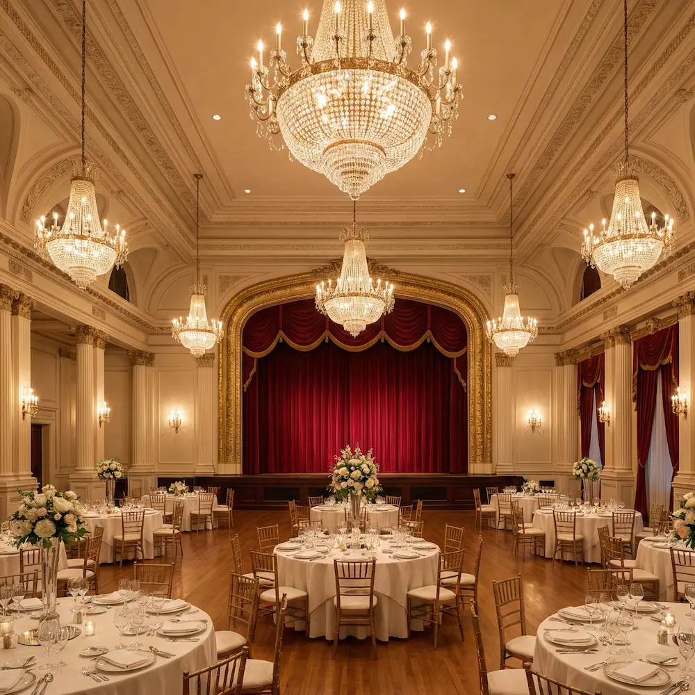
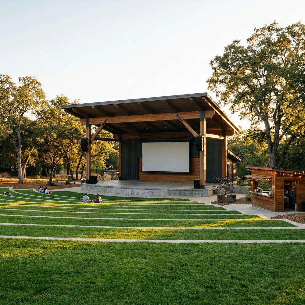
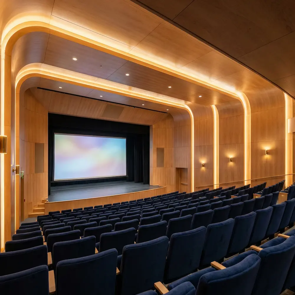
Featured venues
A hand-picked selection of spaces across three countries, ready for your next booking.
| Property | Type | Description |
|---|---|---|
variant | default | master | admin | destructive | The available variants of this component. |
size | default | form | The available sizes of this component. |
Every Panel separates from the page by fill, not by a shadow: a white surface against the gray page background, traced by a quiet rim.
Panel has four variants. They match the ones in Card and Badge so master, admin, and destructive sections read consistently, whether they show up as a collection item or a page region.
| Variant | Description | When to use |
|---|---|---|
default | Subtle surface tint. | Most page sections: profile, notifications, billing. |
master | Tint and accent for master users. | Sections only master users see. Learn more. |
admin | Tint and accent for admin users. | Sections only admin users see. Learn more. |
destructive | Tint for danger zones. | Irreversible actions, like deleting an account or revoking access. |
Panel also offers two sizes. The default is unconstrained and grows with its container. The form size caps the Panel at a comfortable reading width so long label-input pairs don't stretch across the page.
| Size | Description | When to use |
|---|---|---|
default | Full width of the parent. | Data-heavy sections: tables, lists, dashboards, prose. |
form | Caps the Panel at a reading width. | Form-heavy sections so fields stay easy to scan top-to-bottom. |
Usage
Panel is the primary tool for giving a page structure. Dense screens, like settings, admin forms, or dashboards, hold more fields than a user can scan in one pass. Breaking that content into labeled regions turns a wall of inputs into scannable topics.
A page typically has two to six Panels, each owning one topic. A settings page, for example, might split into "Store Information", "Regional Settings", and "Notifications". Each Panel groups related fields under a single heading, so a user can find the section they need without reading everything before it.
Panel is content-agnostic: form fields, tables, media, or text blocks can all live inside. The one rule is topical cohesion. Everything in a Panel should share the topic its title names. Without that, the Panel stops being a region and turns into a box.
Panel vs Card
Panel and Card look similar, but they solve different problems. A Panel is a named region of a page, usually unique, with its own title and (sometimes) actions. A Card stands in for one item in a collection and is built to repeat.
Rule of thumb
If the element repeats as you scroll (events, products, team members), reach for a Card. If it owns a page region on its own, like "Organizer profile", "Team members", or "Billing", reach for a Panel.
Header
The header names the section and tells the user what it's about before they read a single field. It has three slots: a title, an optional description, and an optional actions region on the right (covered in Actions below). Each slot has its own job.
Title
The title is how a user finds this section when they scan the page. Aim for a short noun phrase, two to five words, that names the topic.
Do
Do
Do
Front-load the meaningful keyword so the user recognizes the section at a glance.
Don't
Don't use a generic heading that two sections could share.
Every Panel needs a name
A Panel is a landmark region, and assistive technologies need a name for it.
Include a title, or pass an aria-label on the Panel itself when the section
does not have a visible title.
Description
A description is a single-sentence subtitle directly under the title. Include one when the title alone doesn't tell the user what's at stake, or when the section introduces a concept they may not have seen before. Skip it when the title already says it. A description that restates the heading adds reading weight without adding information.
The header configures its children
Panel.Header is the layout wrapper that arranges title, description, and actions in a grid. Drop a <Title>, an optional <Description>, and any buttons (<Button>, <ButtonGroup>, <ActionMenu>, <LinkButton>) directly inside it. The header configures slot context so each piece picks up its level, id wiring, grid position, size, and variant from the Panel, so consumers don't need to set any of that themselves. A bare <Button> is slot-aware here. Opt one out of the cascade with slot={null}.
Multiple actions belong in a <ButtonGroup> so the cluster claims one grid cell and renders as a toolbar.
Title-only Panels can skip the header
When a Panel has only a title (no description, no actions), drop a bare <Title> directly inside <Panel> and skip the wrapper. Accessibility wires up the same way (aria-labelledby resolves to the title), and the title still aligns with the panel's horizontal padding. As soon as a Panel needs a description or actions, reach for <Panel.Header> so the slot context arranges them in the grid.
Quick settings
import { Panel, Stack, TextField, Title } from '@marigold/components';export default () => ( <Panel> <Title>Quick settings</Title> <Panel.Content> <Stack space="regular"> <TextField label="Display name" defaultValue="Marigold Events" /> <TextField label="Support email" defaultValue="hello@marigold-ui.io" /> </Stack> </Panel.Content> </Panel>);Content
The content area is the body of the Panel. It's deliberately open, and in practice most sections you'll build are one of three shapes:
- Form sections group related fields under one topic, like "Store information" or "Notifications". Stack the fields so labels and inputs share a vertical rhythm.
- Data sections put a single table, list, chart, diagram, or media surface at the centre of the region. These usually want full-width content.
- Prose sections explain a concept or a consequence before the user acts, common above a Danger zone or at the top of a settings page.
Panel doesn't impose a layout primitive. Reach for the same tools you'd use outside a Panel (<Stack>, <Inline>, a grid). The Panel owns the region. The content inside still owns its own rhythm.
Full-width content
By default, content sits inside the Panel's horizontal padding so its left and right edges line up with the header and footer. That shared edge is what makes the Panel read as one region.
Tables, media, charts, and status bars are the exceptions. They look cramped when inset and read best edge-to-edge. Opt in with the bleed prop on the content area.
Recent bookings
Last 7 days, across all events.
Booking | Event | Customer | Tickets | Amount | Status |
|---|---|---|---|---|---|
BKG-2401 | Summer Comedy Night | Alice Chen | 2 | €48.00 | Confirmed |
BKG-2402 | Oak Ridge Wedding Showcase | Bob Martinez | 4 | €96.00 | Pending |
BKG-2403 | Harborfront Jazz Festival | Charlie Park | 1 | €65.00 | Confirmed |
BKG-2404 | Grand Avenue Gala | Diana Wong | 8 | €480.00 | Refunded |
BKG-2405 | Maple Court Film Night | Eli Brown | 3 | €45.00 | Confirmed |
import { useState } from 'react';import { Badge, Description, Inline, Pagination, Panel, Table, Text, Title,} from '@marigold/components';import { NumericFormat } from '@marigold/system';const bookings = [ { id: 'BKG-2401', event: 'Summer Comedy Night', customer: 'Alice Chen', tickets: 2, amount: 48, status: 'Confirmed', variant: 'success', }, { id: 'BKG-2402', event: 'Oak Ridge Wedding Showcase', customer: 'Bob Martinez', tickets: 4, amount: 96, status: 'Pending', variant: 'warning', }, { id: 'BKG-2403', event: 'Harborfront Jazz Festival', customer: 'Charlie Park', tickets: 1, amount: 65, status: 'Confirmed', variant: 'success', }, { id: 'BKG-2404', event: 'Grand Avenue Gala', customer: 'Diana Wong', tickets: 8, amount: 480, status: 'Refunded', variant: 'error', }, { id: 'BKG-2405', event: 'Maple Court Film Night', customer: 'Eli Brown', tickets: 3, amount: 45, status: 'Confirmed', variant: 'success', },] as const;const pageSize = bookings.length;const totalItems = pageSize * 162;export default () => { const [page, setPage] = useState(1); const start = (page - 1) * pageSize + 1; const end = Math.min(start + pageSize - 1, totalItems); return ( <Panel> <Panel.Header> <Title>Recent bookings</Title> <Description>Last 7 days, across all events.</Description> </Panel.Header> <Panel.Content bleed> <Table aria-label="Recent bookings"> <Table.Header> <Table.Column rowHeader>Booking</Table.Column> <Table.Column minWidth={200}>Event</Table.Column> <Table.Column>Customer</Table.Column> <Table.Column alignX="right">Tickets</Table.Column> <Table.Column alignX="right">Amount</Table.Column> <Table.Column width={120}>Status</Table.Column> </Table.Header> <Table.Body items={bookings}> {booking => ( <Table.Row id={booking.id}> <Table.Cell>{booking.id}</Table.Cell> <Table.Cell>{booking.event}</Table.Cell> <Table.Cell>{booking.customer}</Table.Cell> <Table.Cell>{booking.tickets}</Table.Cell> <Table.Cell> <NumericFormat style="currency" currency="EUR" value={booking.amount} /> </Table.Cell> <Table.Cell> <Badge variant={booking.variant}>{booking.status}</Badge> </Table.Cell> </Table.Row> )} </Table.Body> </Table> </Panel.Content> <Panel.Content> <Inline alignY="center" alignX="between"> <Text fontSize="sm"> Showing {start} - {end} of {totalItems} </Text> <Pagination totalItems={totalItems} pageSize={pageSize} page={page} onChange={setPage} /> </Inline> </Panel.Content> </Panel> );};Tables get a small bonus: when bled, their cell edges line up with the Panel's header and footer, so what's inside a row still reads in rhythm with the title above it.
An <Accordion> behaves the same way. Drop one into a bled content area and its item dividers span edge-to-edge while the header and content stay inset, aligned with the Panel title. No extra prop is needed: the Accordion picks up the Panel's horizontal padding automatically, exactly like Table cells do.
Reach for this only when the Panel's body is a set of peer, equally-weighted sections that each expand: a per-field breakdown, a list of records each with details. For a single optional or advanced fold alongside visible primary content, use Panel.Collapsible instead. The two aren't interchangeable: a stack of Collapsibles is exactly the anti-pattern Accordion exists to solve (see One Collapsible per Panel).
Prop values
Usage across all Button instances, last 30 days.
import { Accordion, Badge, Description, Inline, Panel, Stack, Text, Title,} from '@marigold/components';const props = [ { name: 'variant', total: 1284, values: [ { value: 'primary', count: 812 }, { value: 'secondary', count: 341 }, { value: 'destructive', count: 131 }, ], }, { name: 'size', total: 1284, values: [ { value: 'default', count: 1043 }, { value: 'small', count: 241 }, ], }, { name: 'disabled', total: 1284, values: [ { value: 'false', count: 1198 }, { value: 'true', count: 86 }, ], },] as const;export default () => ( <Panel> <Panel.Header> <Title>Prop values</Title> <Description> Usage across all Button instances, last 30 days. </Description> </Panel.Header> <Panel.Content bleed> <Accordion defaultExpandedKeys={['variant']}> {props.map(prop => ( <Accordion.Item key={prop.name} id={prop.name}> <Accordion.Header> <Inline space={2} alignY="center"> <Text>{prop.name}</Text> <Badge>{prop.values.length}</Badge> </Inline> </Accordion.Header> <Accordion.Content> <Stack space={2}> {prop.values.map(entry => ( <Inline key={entry.value} alignX="between" alignY="center"> <Text fontSize="sm">{entry.value}</Text> <Text fontSize="sm" color="secondary"> {Math.round((entry.count / prop.total) * 100)}% </Text> </Inline> ))} </Stack> </Accordion.Content> </Accordion.Item> ))} </Accordion> </Panel.Content> </Panel>);Two details are intentional for now: there is no divider between the Panel.Header and the first item, and the last item's bottom corners stay square rather than following the Panel's radius.
Collapsible
Some sections have fields most users won't touch, like legacy SEO settings, import defaults, or an optional webhook URL. Hiding them by default keeps the Panel scannable for the common case, while staying one click away for anyone who needs them.
Reach for a Collapsible when a handful of fields in a Panel are:
- Optional, and unrelated to the primary action of the section.
- Advanced, meant for power users who already know what they're looking for.
- Uncommon, edited rarely enough that showing them by default adds noise.
Event details
Information shown on the event page, confirmations, and tickets.
import { venues } from '@/lib/data/venues';import { DatePicker, Description, Panel, Select, Stack, TextField, Title,} from '@marigold/components';export default () => ( <Panel size="form"> <Panel.Header> <Title>Event details</Title> <Description> Information shown on the event page, confirmations, and tickets. </Description> </Panel.Header> <Panel.Content> <Stack space="regular"> <TextField label="Event title" defaultValue="Summer Comedy Night" /> <DatePicker label="Start date" /> <Select label="Venue" placeholder="Select a venue"> {venues.slice(0, 6).map(v => ( <Select.Option key={v.id} id={v.id}> {v.name} </Select.Option> ))} </Select> </Stack> </Panel.Content> <Panel.Collapsible> <Panel.CollapsibleHeader> <Title>SEO & tracking</Title> <Description> Optional metadata used on the event page and in social shares. </Description> </Panel.CollapsibleHeader> <Panel.CollapsibleContent> <Stack space="regular"> <TextField label="URL slug" description="Used in the event page URL." defaultValue="summer-comedy-night" /> <TextField label="Analytics tracking ID" /> <TextField label="Social share image URL" /> </Stack> </Panel.CollapsibleContent> </Panel.Collapsible> </Panel>);What to keep visible
A Collapsible is for fields that are safe to miss. Anything else belongs in the main content, where users can scan it without clicking. In particular, don't fold away:
- Required fields. Hiding something a user must fill in to save the form is the classic trap. They submit, the form errors inside a collapsed section, and they're left hunting for an invisible field. If you find yourself wanting to fold one away, that's usually a sign something else is off: maybe the field isn't really required, or the section deserves its own Panel.
- Content central to the Panel's topic. If a Panel is "Billing address", hiding the address fields themselves defeats the Panel. A Collapsible is for the periphery of the topic, not the topic itself.
- Non-obvious defaults. Settings the user would want to notice, like a timezone pinned to "UTC" on a regional account, shouldn't sit behind a fold. Out of sight means out of audit.
- An overloaded Panel. If a Panel feels too long, split it into two Panels with clearer names. A Collapsible that folds away half the content is usually papering over the wrong problem.
- Fields with validation errors. Even optional fields can have format errors: an invalid tracking ID, a malformed webhook URL. When a Collapsible is closed and one of its fields fails validation on submit, the error message has no visible target. Auto-expand the section so the error shows up where the user can see it. The demo below shows the pattern.
The example wraps the Panel in a <Form> and validates on submit. The invalid tracking ID is pre-filled inside a closed Collapsible. Click Save to run the submit handler: it reads the form data, checks the field, and forces the Collapsible open when validation fails.
import { useState } from 'react';import type { ComponentProps } from 'react';import { Button, Description, Form, Inline, Panel, Stack, TextField, Title, parseFormData,} from '@marigold/components';const TRACKING_ID_PATTERN = /^G-[A-Z0-9]{10}$/;type SubmitHandler = NonNullable<ComponentProps<typeof Form>['onSubmit']>;export default () => { const [expanded, setExpanded] = useState(false); const [error, setError] = useState(false); const handleSubmit: SubmitHandler = event => { event.preventDefault(); const { trackingId = '' } = parseFormData<{ trackingId: string }>(event); const invalid = trackingId !== '' && !TRACKING_ID_PATTERN.test(trackingId); setError(invalid); if (invalid) setExpanded(true); }; return ( <Form onSubmit={handleSubmit}> <Stack space="regular"> <Panel size="form"> <Panel.Header> <Title>Event details</Title> </Panel.Header> <Panel.Content> <TextField name="title" label="Event title" defaultValue="Summer Comedy Night" /> </Panel.Content> <Panel.Collapsible expanded={expanded} onExpandedChange={setExpanded}> <Panel.CollapsibleHeader> <Title>SEO & tracking</Title> <Description> Optional metadata used on the event page and in social shares. </Description> </Panel.CollapsibleHeader> <Panel.CollapsibleContent> <TextField name="trackingId" label="Analytics tracking ID" description="Format: G-XXXXXXXXXX" errorMessage="That does not look like a valid Google Analytics ID." defaultValue="invalid-id-123" onChange={() => { if (error) setError(false); }} error={error} /> </Panel.CollapsibleContent> </Panel.Collapsible> </Panel> <Inline space="related" alignY="center"> <Button variant="primary" type="submit"> Save </Button> <Button variant="secondary" type="button"> Cancel </Button> </Inline> </Stack> </Form> );};One Collapsible per Panel
A Panel owns one topic, named by its title. A single Collapsible folds away the topic's periphery while the visible content still carries the section. Two or more folds flip that relationship: users see the title, a stack of closed triggers, and nothing to orient them. The Panel stops being a section and starts being a navigator.
When a Panel seems to want a second Collapsible, the shape is usually off in one of two ways:
- The Panel is trying to own two topics. Split it into two Panels with clearer titles. Each gets its own scannable content and, if they need it, their own single Collapsible.
- The content is a set of peer sub-sections that all live at the same level. Reach for Accordion instead. Accordion is built for parallel collapsible items. Panel is not.
A Panel made entirely of Collapsibles runs into the same problem: the title labels an empty container, and the user has to click before anything reads. A single fold in an otherwise bare Panel can work when the Panel is purely a wrapper for one advanced section. Anything more should be an Accordion.
Actions
A Panel has three places for actions, each carrying a different scope:
- Header. For controls that act on the whole section, like "Invite member" or "Reset to defaults". Putting them in the header anchors them to the title, so their scope is clear: they act on this section, not on the page or on a row inside it. Keep the set small: one prominent button, or an overflow menu when a handful of related controls belong together. More than that usually means the scope is too broad, and one of the actions probably belongs in its own Panel.
Team members
People with access to this workspace and their roles.




import { people } from '@/lib/data/people';import { ActionMenu, Badge, Button, Description, Inline, Panel, Stack, Text, Title,} from '@marigold/components';import { UserRoundPlus } from '@marigold/icons';const members = [ { ...people[0], role: 'Admin', variant: 'admin' }, { ...people[1], role: 'Editor', variant: 'default' }, { ...people[2], role: 'Editor', variant: 'default' }, { ...people[3], role: 'Viewer', variant: 'default' },];export default () => ( <Panel> <Panel.Header> <Title>Team members</Title> <Description> People with access to this workspace and their roles. </Description> <Button size="icon" aria-label="Invite member"> <UserRoundPlus /> </Button> </Panel.Header> <Panel.Content> <Stack space="regular"> {members.map(member => ( <Inline key={member.id} space="regular" alignY="center" alignX="between" > <Inline space="related" alignY="center"> <img src={member.avatar} alt="" className="size-9 shrink-0 rounded-full object-cover" /> <Stack space="tight"> <Text weight="medium">{member.name}</Text> <Text size="xs" color="secondary"> {member.position} </Text> </Stack> </Inline> <Inline space="regular" alignY="center"> <Badge variant={member.variant}>{member.role}</Badge> <ActionMenu size="icon" aria-label={`Manage ${member.name}`}> <ActionMenu.Item id="change-role">Change role</ActionMenu.Item> <ActionMenu.Item id="resend-invite"> Resend invite </ActionMenu.Item> <ActionMenu.Item id="remove" variant="destructive"> Remove from workspace </ActionMenu.Item> </ActionMenu> </Inline> </Inline> ))} </Stack> </Panel.Content> </Panel>);- Footer. For a single, weighty action scoped to the Panel, most often a destructive one. Rare, because header actions cover most section-scoped controls and page-level Save/Cancel sit outside the Panel. Reach for it when a Panel needs its own action space. See Danger zone below for the canonical pattern.
- Outside the Panel. For page-level controls like Save changes and Cancel at the bottom of a settings form. A Panel owns one region. A page-level action crosses every region on the page, and anchoring it to any single Panel misrepresents its scope.
Actions that belong to a row or item inside the content stay with their row, not in the Panel's header or footer.
Danger zone
A Danger zone is a clearly-marked section for actions that can't be undone: deleting an account, wiping data, transferring ownership, revoking access. Use the destructive variant so the surface itself warns the user, and put it last so it stays out of the way while they're editing safer settings.
Reach for a Danger zone when the action is one of these:
- Not reversible. Deleting records. Wiping logs. Cancelling a subscription with no grace period.
- Removes access or changes identity. Transferring ownership, kicking someone off the workspace, rotating the primary API key.
- Affects people outside the current account. Cancelling events that customers hold tickets for. Closing a workspace other people depend on.
Anything reversible or low-stakes, like sign-out or reset-to-defaults, does not need a Danger zone. Keep it in the normal flow.
Most Danger zones hold one action. Put it in the Footer (see Actions for why), with a short paragraph in the Content explaining what disappears. Lead with the consequence, not the verb.
Delete organizer
This is permanent. There's no undo.
import { Button, Description, Panel, Text, Title } from '@marigold/components';export default () => ( <Panel variant="destructive"> <Panel.Header> <Title>Delete organizer</Title> <Description>This is permanent. There's no undo.</Description> </Panel.Header> <Panel.Content> <Text> Deleting the organizer removes the account along with every published event, past booking, and customer record. Ticket holders are notified and refunded automatically. </Text> </Panel.Content> <Panel.Footer> <Button variant="destructive">Delete organizer</Button> </Panel.Footer> </Panel>);If a couple of destructive actions genuinely belong together (say "Archive" next to "Delete"), stack them as rows inside the Content, each with a one-line consequence and its own destructive button. The Footer stays empty in that shape.
Danger zone
Permanent actions that affect this organizer. There's no undo.
import { Button, Description, Inline, Panel, Stack, Text, Title,} from '@marigold/components';const actions = [ { id: 'archive', label: 'Archive organizer', description: 'Hides every event from customers and locks the account. Past bookings and reports stay available.', action: 'Archive', }, { id: 'transfer', label: 'Transfer ownership', description: 'Hands the organizer, its events, and its billing details to another user. You lose access immediately.', action: 'Transfer', }, { id: 'delete', label: 'Delete organizer', description: 'Permanently removes the account, every event, and all booking history. Ticket holders are notified and refunded.', action: 'Delete', },];export default () => ( <Panel variant="destructive"> <Panel.Header> <Title>Danger zone</Title> <Description> Permanent actions that affect this organizer. There's no undo. </Description> </Panel.Header> <Panel.Content> <Stack space="regular"> {actions.map(item => ( <Inline key={item.id} alignY="center" alignX="between" space="group"> <Stack space="tight"> <Text weight="medium">{item.label}</Text> <Text size="xs" color="secondary"> {item.description} </Text> </Stack> <Button variant="destructive-ghost">{item.action}</Button> </Inline> ))} </Stack> </Panel.Content> </Panel>);Spacing
Panel controls two kinds of spacing: the padding inside each slot, and the gap between slots. The defaults suit most settings pages. Reach for the overrides when a Panel is unusually dense or unusually roomy.
Padding
Every slot is inset with p="square-regular". Stay with the default in most cases. Use square-loose when a Panel holds long prose or sits alone on the page, and px/py when content is wide but short and uniform padding feels cramped vertically.
<Panel p="square-loose">…</Panel>
<Panel px="padding-relaxed" py="padding-snug">…</Panel>
Section gap
space controls the gap between header, content, and footer. Default regular works almost everywhere. Drop to none when the slots should read as one dense surface, like a full-width table that reaches the Panel's edges. Step up to group when the Panel carries several distinct blocks that need more breathing room.
<Panel space="none">…</Panel>
<Panel space="group">…</Panel>
Accessibility
Panel renders a <section> and wires up the heading outline. Most of the story is handled for you. Two parts need your attention: giving the Panel a name, and making sure its heading levels match the page it sits in.
Labeling
A <section> only becomes a region landmark once it has an accessible name. Without one, it's just a grouping element. Give the Panel a name in one of two ways:
- Preferred. Include a
<Title>inside<Panel.Header>. The Panel is automatically labelled by the title. - Fallback. If the Panel has no visible title (a Collapsible-only Panel, for example), pass an
aria-labelon the Panel itself.
If both are set, aria-label takes precedence and the title is no longer used as the accessible name. Passing both is redundant, so pick one.
Heading levels
<Title> renders an <h2> by default. Inside <Panel.CollapsibleHeader> it renders one level deeper (<h3>) when the Panel has a title to nest under, with the structural heading provided by the collapsible header itself. In a Collapsible-only Panel (no <Title>), the collapsible heading renders at the base headingLevel instead, since there's no parent heading to defer to.
If the Panel lives under an existing <h2> on the page (inside a Tabs panel, for example), shift both down together with headingLevel:
<Panel headingLevel={3}>
  <Title>…</Title> {/* renders as <h3> */}
  <Panel.Collapsible>
    <Panel.CollapsibleHeader>
      <Title>…</Title> {/* renders inside an <h4> */}
    </Panel.CollapsibleHeader>
  </Panel.Collapsible>
</Panel>
Collapsible sections
<Panel.Collapsible> wraps each header in a heading whose button carries aria-expanded. The title and description render as spans inside the trigger button so the entire header surface is a single click target. The button's accessible name comes from the title via aria-labelledby, and the description is linked via aria-describedby so screen readers announce the extra context after the name. The caret is marked aria-hidden, so only the title and description are read. Keyboard users toggle a section with Enter or Space.
Props
Panel
Prop
Type
Accessibility props (54)
Prop
Type
DOM event handlers (164)
Prop
Type
Panel.Header
Prop
Type
Panel.Content
Prop
Type
Panel.Footer
Panel.Collapsible
Prop
Type
DOM event handlers (64)
Prop
Type
Panel.CollapsibleHeader
Prop
Type
Panel.CollapsibleContent
Prop
Type