LinkButton
Interactive component that resembels a button to help users navigate to new pages.
The <LinkButton> component provides a visually distinct, button-like element that functions as a navigational link. It combines the accessibility and semantics of a link with the appearance and interactivity of a button, making it ideal for scenarios where users need a clear call-to-action that leads to another page or resource.
Anatomy
A link button consists of a pressable area, often containing a textual label or icon, which users can press or activate using the Space or Enter keys.
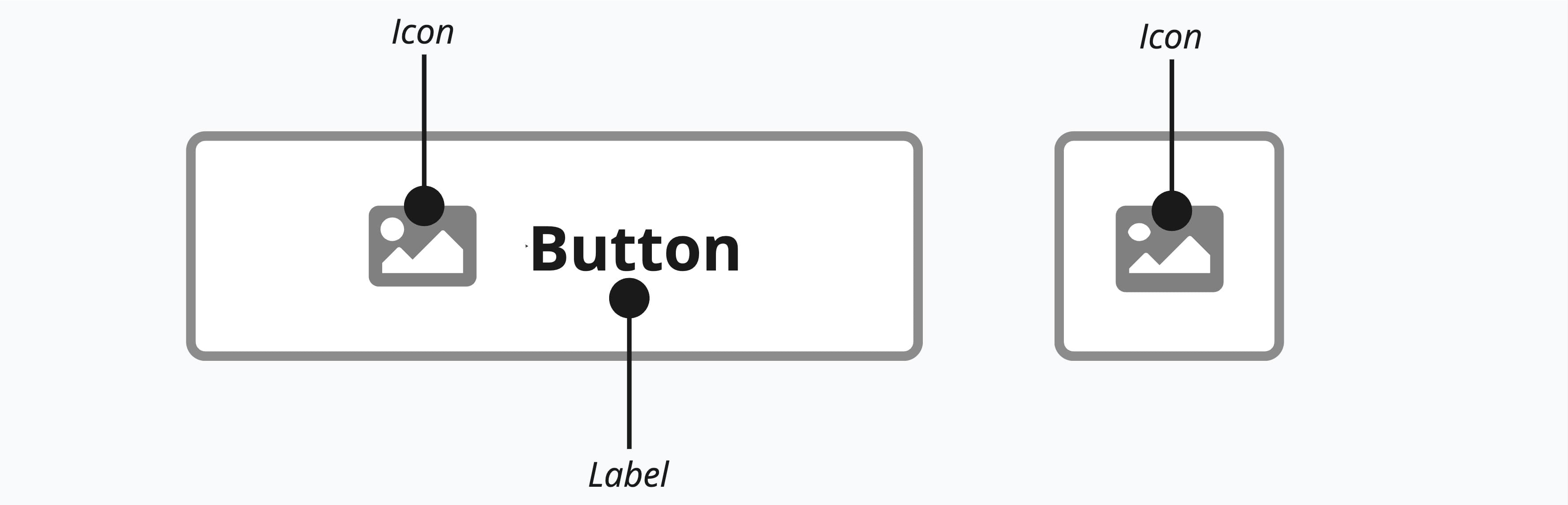
Appearance
The appearance of a component can be customized using the variant and size props. These props adjust the visual style and dimensions of the component, available values are based on the active theme.
| Property | Type | Description |
|---|---|---|
variant | primary | secondary | ghost | destructive | destructive-ghost | link | The available variants of this component. |
size | default | small | large | icon | The available sizes of this component. |
The LinkButton shares the same visual variants as the Button component, applied to a navigational element.
| Variant | Description | When to use |
|---|---|---|
primary | High-contrast, filled button that draws attention. | The most important navigational action, like "Get started" or "Sign up". |
secondary | Neutral button with a subtle border. This is the default variant. | Supporting navigational actions that complement the primary, like "Learn more". |
ghost | Transparent button with no border or background. | Low-emphasis navigation that should be available but not prominent. |
destructive | Red filled button signaling a dangerous action. | Navigation related to destructive flows, like going to a deletion confirmation page. |
destructive-ghost | Red text with no background. | Destructive navigation that is not the primary focus of the current view. |
link | Styled as an inline text link. | Navigation that should visually blend with surrounding text. |
Usage
A link button should be used whenever the primary user action is navigation. It is the ideal choice when you need the visual prominence of a button for a call-to-action that directs the user to a different page or URL. For example, a "Sign Up Now" or "Learn More" element that takes the user to a new registration or features page is a perfect use case. Using a link button ensures that standard browser behaviors, such as opening a link in a new tab or copying the address, are preserved.
In contrast, a regular button is meant for performing an action on the current page. You should use a regular button when the user is submitting a form, opening a modal window, toggling a setting, or saving data without changing the URL. Essentially, if the component's purpose is to do something on the current view, use a button. If it is meant to go somewhere else, use a link button.
Visual Twins
The link button is the button's visual twin, so it must follow all the same guidelines. The only difference is that it's a link used for navigation. View button guidelines
In context
<LinkButton> is the navigation flavor of <Button>. When dropped inside a <ButtonGroup>, or any container that publishes its own ButtonContext, it picks up the same variant and size cascade as a nested <Button>. The two coexist naturally in row-action clusters. Use <Button> for actions that fire on the current page (like "delete" or "archive"), and <LinkButton> for actions that navigate (like opening a detail page for editing).
import { Button, ButtonGroup, LinkButton } from '@marigold/components';import { Edit, Trash } from '@marigold/icons';export default () => ( <ButtonGroup aria-label="Row actions" size="small"> <LinkButton href="#" aria-label="Edit"> <Edit /> </LinkButton> <Button variant="destructive-ghost" aria-label="Delete" onPress={() => alert('Delete')} > <Trash /> </Button> </ButtonGroup>);Inside a ButtonGroup
<LinkButton> shares the full <Button> variant vocabulary. With no local
variant, it inherits the group's cascade, which defaults to secondary, the
same baseline as a standalone button. A local variant or size always wins
over the group.
Props
Prop
Type
Accessibility props (4)
Prop
Type
DOM event handlers (63)
Prop
Type