Calendar
A date selection interface for choosing dates from a calendar view.
The <Calendar> is a date selection interface that allows you to choose a date using a visual calendar view. It displays a month grid with navigable months and years, making it easy to browse and select specific dates.
Anatomy
The <Calendar> consists of a header and a grid section. Inside of the header there are two select lists, one for a month and one for a year. In the grid section there is a grid of selectable dates.
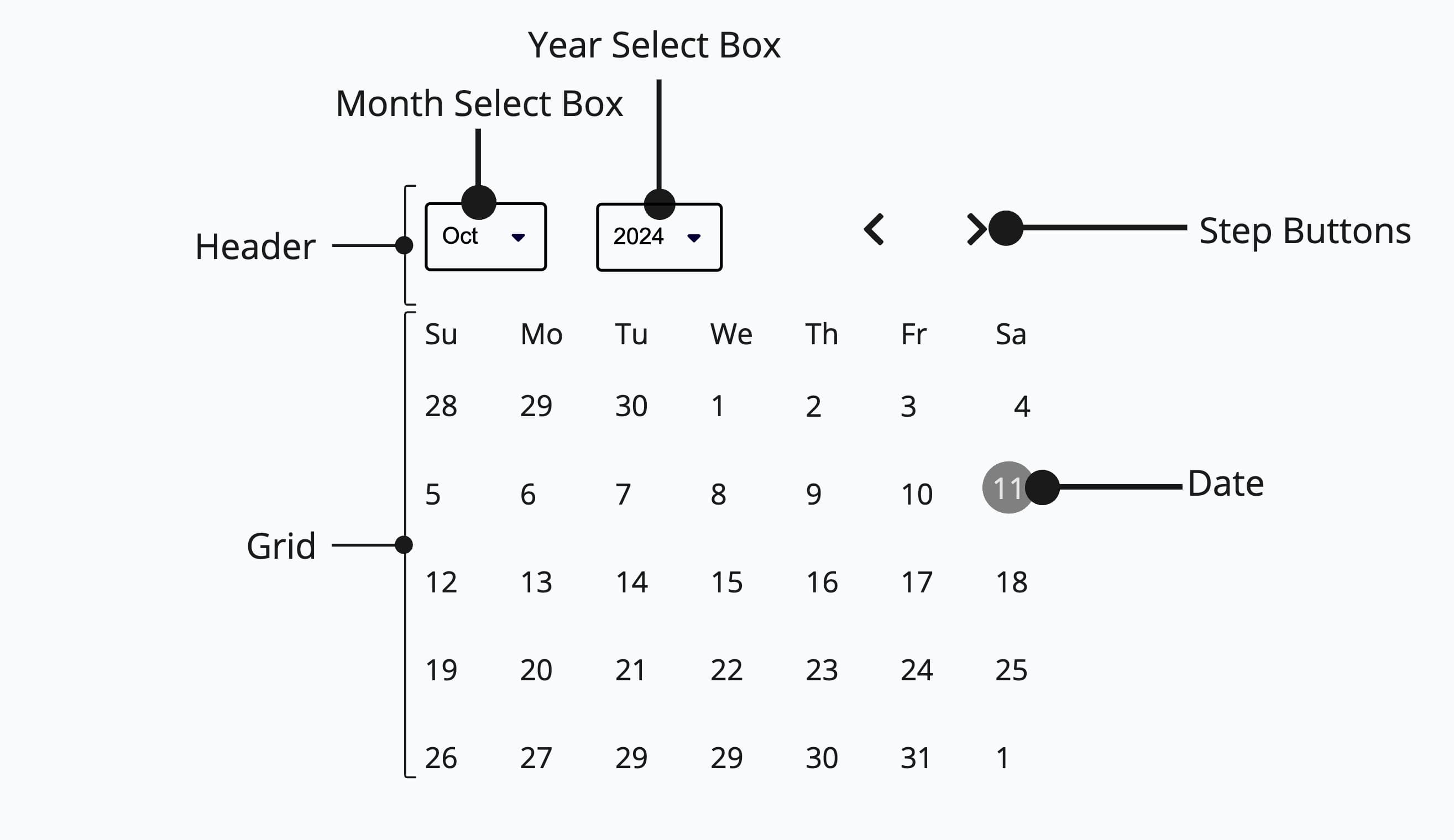
Appearance
The appearance of a component can be customized using the variant and size props. These props adjust the visual style and dimensions of the component, available values are based on the active theme.
| Su | Mo | Tu | We | Th | Fr | Sa |
|---|---|---|---|---|---|---|
28 | 29 | 30 | 1 | 2 | 3 | 4 |
5 | 6 | 7 | 8 | 9 | 10 | 11 |
12 | 13 | 14 | 15 | 16 | 17 | 18 |
19 | 20 | 21 | 22 | 23 | 24 | 25 |
26 | 27 | 28 | 29 | 30 | 31 | 1 |
| Property | Type | Description |
|---|---|---|
variant | - | The available variants of this component. |
size | - | The available sizes of this component. |
Usage
The <Calendar> should be used for experiences where you need to visualize and select dates over an entire month, such as event scheduling or availability views. For most other scenarios, especially where compact input or flexible validation is important, consider using <DatePicker> or <DateField>.
Do
Use <Calendar> when the user benefits from seeing surrounding dates for
context, such as booking or scheduling interfaces.
Don't
Don't use <Calendar> for simple date entry where a compact
<DatePicker> or <DateField> would suffice.
Basic Usage (uncontrolled)
This example shows a basic <Calendar> without any special props. The component manages its own state internally.
| Su | Mo | Tu | We | Th | Fr | Sa |
|---|---|---|---|---|---|---|
28 | 29 | 30 | 1 | 2 | 3 | 4 |
5 | 6 | 7 | 8 | 9 | 10 | 11 |
12 | 13 | 14 | 15 | 16 | 17 | 18 |
19 | 20 | 21 | 22 | 23 | 24 | 25 |
26 | 27 | 28 | 29 | 30 | 31 | 1 |
import { Calendar } from '@marigold/components';export default () => <Calendar aria-label="Event date" />;Controlled
The value and onChange props can be used to control the selected date externally. This is useful when you need to display or process the selected date elsewhere in your application.
| Su | Mo | Tu | We | Th | Fr | Sa |
|---|---|---|---|---|---|---|
27 | 28 | 29 | 30 | 31 | 1 | 2 |
3 | 4 | 5 | 6 | 7 | 8 | 9 |
10 | 11 | 12 | 13 | 14 | 15 | 16 |
17 | 18 | 19 | 20 | 21 | 22 | 23 |
24 | 25 | 26 | 27 | 28 | 29 | 30 |
31 | 1 | 2 | 3 | 4 | 5 | 6 |
Selected Date: Day: 7 Month: 8 Year: 2025
import type { DateValue } from '@internationalized/date';import { CalendarDate } from '@internationalized/date';import { useState } from 'react';import { Calendar, Stack } from '@marigold/components';export default () => { const [value, setValue] = useState<DateValue>(new CalendarDate(2025, 8, 7)); return ( <Stack space={3}> <Calendar aria-label="Event date" value={value} onChange={newValue => setValue(newValue!)} /> <pre> <strong>Selected Date: </strong> {`Day: ${value.day} Month: ${value.month} Year: ${value.year}`} </pre> </Stack> );};Min/Max Values
The minValue and maxValue props restrict the selectable date range. Dates outside the specified range are automatically disabled, preventing the user from selecting invalid dates.
Always disable dates that cannot be selected, such as past dates for a future booking, or dates outside a valid business range. This prevents user errors and communicates constraints visually.
Do
Disable dates outside the valid range using minValue/maxValue or mark
specific dates as unavailable with the dateUnavailable prop.
Don't
Don't show all dates as selectable when some are invalid. This leads to errors and forces users to guess which dates are allowed.
| Su | Mo | Tu | We | Th | Fr | Sa |
|---|---|---|---|---|---|---|
1 | 2 | 3 | 4 | 5 | 6 | 7 |
8 | 9 | 10 | 11 | 12 | 13 | 14 |
15 | 16 | 17 | 18 | 19 | 20 | 21 |
22 | 23 | 24 | 25 | 26 | 27 | 28 |
29 | 30 | 1 | 2 | 3 | 4 | 5 |
import { CalendarDate } from '@internationalized/date';import { Calendar } from '@marigold/components';export default () => ( <Calendar aria-label="Event date" minValue={new CalendarDate(2025, 6, 5)} maxValue={new CalendarDate(2025, 6, 20)} />);Unavailable Dates
The dateUnavailable prop accepts a callback function that is called for each date in the calendar. If it returns true, the date is marked as unavailable. This is useful for blocking out specific dates like weekends or holidays.
| Su | Mo | Tu | We | Th | Fr | Sa |
|---|---|---|---|---|---|---|
28 | 29 | 30 | 1 | 2 | 3 | 4 |
5 | 6 | 7 | 8 | 9 | 10 | 11 |
12 | 13 | 14 | 15 | 16 | 17 | 18 |
19 | 20 | 21 | 22 | 23 | 24 | 25 |
26 | 27 | 28 | 29 | 30 | 31 | 1 |
import type { DateValue } from '@internationalized/date';import { isWeekend } from '@internationalized/date';import { useLocale } from '@react-aria/i18n';import { Calendar } from '@marigold/components';export default () => { const { locale } = useLocale(); return ( <Calendar aria-label="Appointment date" dateUnavailable={(date: DateValue) => isWeekend(date, locale)} /> );};Multiple Months
Use the visibleDuration prop to display multiple months at once. This is helpful for date range selection or when users need to see a broader time span. Up to 3 months are supported.
July 2026
| Su | Mo | Tu | We | Th | Fr | Sa |
|---|---|---|---|---|---|---|
28 | 29 | 30 | 1 | 2 | 3 | 4 |
5 | 6 | 7 | 8 | 9 | 10 | 11 |
12 | 13 | 14 | 15 | 16 | 17 | 18 |
19 | 20 | 21 | 22 | 23 | 24 | 25 |
26 | 27 | 28 | 29 | 30 | 31 | 1 |
August 2026
| Su | Mo | Tu | We | Th | Fr | Sa |
|---|---|---|---|---|---|---|
26 | 27 | 28 | 29 | 30 | 31 | 1 |
2 | 3 | 4 | 5 | 6 | 7 | 8 |
9 | 10 | 11 | 12 | 13 | 14 | 15 |
16 | 17 | 18 | 19 | 20 | 21 | 22 |
23 | 24 | 25 | 26 | 27 | 28 | 29 |
30 | 31 | 1 | 2 | 3 | 4 | 5 |
import { Calendar } from '@marigold/components';export default () => ( <Calendar aria-label="Event date" visibleDuration={{ months: 2 }} />);When users need to select dates far in the past or future (such as a birth date or historical event), a calendar grid forces tedious month-by-month navigation. Even with multiple months visible, this does not solve the problem. In those cases, a <DateField> or <DatePicker> is more efficient.
Do
Use <Calendar> for dates close to the present, such as scheduling an
appointment within the next few weeks.
Don't
Don't use <Calendar> for distant dates like birth dates or historical
events. Use <DateField> or <DatePicker> instead.
Quick select presets
Use the presets prop to offer common dates as a one-click list beside the calendar, such as "Today" or "Tomorrow" for a due date. Built-in keys ship with localized labels and correct date math, and custom presets take a label plus a date value or a resolver function. Presets that fall outside minValue/maxValue or land on an unavailable date are disabled.
Calendar accepts the single-date built-ins: today, yesterday and tomorrow. Range keys such as this-week or last-30-days are only available on DateRangePicker and RangeCalendar, where a preset selects a range instead of a single day.
For custom presets, pass value as a function when the date is relative to now (for example "In two weeks"), so it resolves at selection time instead of when the view first rendered. A plain value is right for fixed dates. If you provide several custom presets, give each a unique id: it defaults to the label, so two presets sharing a label would collide.
| Su | Mo | Tu | We | Th | Fr | Sa |
|---|---|---|---|---|---|---|
28 | 29 | 30 | 1 | 2 | 3 | 4 |
5 | 6 | 7 | 8 | 9 | 10 | 11 |
12 | 13 | 14 | 15 | 16 | 17 | 18 |
19 | 20 | 21 | 22 | 23 | 24 | 25 |
26 | 27 | 28 | 29 | 30 | 31 | 1 |
import { Calendar } from '@marigold/components';export default () => ( <Calendar aria-label="Event date" presets={['yesterday', 'today', 'tomorrow']} // [!code highlight] />);Quick select on narrow screens
On small screens the calendar grid renders first, topped by a "Quick selection" row. Tapping it opens the preset list in a bottom sheet, and picking a preset applies it and closes the sheet.
Accessibility
The <Calendar> is built on React Aria and provides full keyboard navigation and screen reader support out of the box.
Keyboard navigation:
- Arrow keys: Move focus between dates
- Page Up/Down: Navigate to previous/next month
- Home/End: Move to the first/last day of the current month
- Enter/Space: Select the focused date
Hint
Always provide an aria-label when using <Calendar> to ensure screen
readers can identify its purpose (e.g. aria-label="Event date").
Localization
The <Calendar> supports many different calendar systems based on the user's locale. You can override the locale by wrapping the calendar with the <I18nProvider> from @marigold/components and setting the locale prop to any supported locale string.
| Mo | Di | Mi | Do | Fr | Sa | So |
|---|---|---|---|---|---|---|
29 | 30 | 1 | 2 | 3 | 4 | 5 |
6 | 7 | 8 | 9 | 10 | 11 | 12 |
13 | 14 | 15 | 16 | 17 | 18 | 19 |
20 | 21 | 22 | 23 | 24 | 25 | 26 |
27 | 28 | 29 | 30 | 31 | 1 | 2 |
import { I18nProvider } from '@marigold/components';import { Calendar } from '@marigold/components';export default () => ( <I18nProvider locale="de-DE"> <Calendar aria-label="Veranstaltungsdatum" /> </I18nProvider>);Props
Calendar
Prop
Type
Accessibility props (4)
Prop
Type
DOM event handlers (64)
Prop
Type
Alternative components
Consider the following alternatives for selecting dates tailored to different user needs and input methods.
DatePicker: The
<DatePicker>allows users to input a date directly as text, in addition to selecting one, and offers more robust validation and error messaging capabilities.DateField: Use the
<DateField>if you need to only use text input to select a date.