Card
Represents one item in a collection.
A <Card> represents one item in a collection, such as an event preview, a venue tile, or a product summary, that repeats next to similar siblings in a grid or list. Each card groups related content (image, title, content, actions) into a single, self-contained unit and sets it apart from the page through fill or tinting: a white card sits on the gray page background with a quiet rim, not a drop shadow.
<Card> renders an <article> landmark, labelled by its <Title> so the card stays identifiable to assistive tech.
Anatomy
The card component is a compound component made up of several sub-components that map to distinct visual areas of the card.
- Card.Media: Optional full-bleed area at the top, typically used for images or media.
- Card.Header: Houses a
<Title>and an optional<Description>. - Card.Content: Main content area for descriptive text or form elements.
- Card.Footer: Bottom area for actions such as buttons or metadata.
Appearance
The appearance of a component can be customized using the variant and size props. These props adjust the visual style and dimensions of the component, available values are based on the active theme.
Grand Avenue Ballroom
Shakytown, United States
| Property | Type | Description |
|---|---|---|
variant | default | master | admin | The available variants of this component. |
size | - | The available sizes of this component. |
The card component supports variants for general content grouping as well as access-level marking.
| Variant | Description | When to use |
|---|---|---|
default | Standard card — set off from the gray page by its lighter fill and a subtle rim rather than a drop shadow. This is the default variant. | General-purpose content grouping like articles, profiles, or summaries. |
admin | Card with admin-specific border and background tint. | Grouping content visible only to admin users. Learn more. |
master | Card with master-specific border and background tint. | Grouping content visible only to master users. Learn more. |
Usage
A <Card> displays one item in a repeating set, such as an event, a product, a venue, or a team member, where each entry has its own visual identity and links to its own detail view. Repetition is the core case. If the element doesn't repeat, a card is probably the wrong tool.
<Card> is one of Marigold's Collection components, alongside <Table>. The rest of this section helps you decide when a card is the right choice, when another Collection component or a Layout primitive fits better, and how to build and lay out cards once you've settled on one.
Panel covers the reverse in its Panel vs Card section.
Card vs Table
<Card> and <Table> are both Collection components. They both display one item in a repeating set, so the choice between them is about display shape, not category.
Reach for <Table> when items share the same fields and the user's task is comparison, sorting, filtering, or bulk action. Reach for <Card> when each item is recognized by its own visuals and links to a detail view, not by its position in a row.
Selectable cards
Reach for selectable cards when the user has to pick from a set of card-shaped options and that choice becomes part of a form. A checkout choosing between Standard, VIP, and Student tickets, a billing page swapping between saved payment methods, a shipping step picking Express over Standard. What sets these apart from a plain card grid is that each card carries a value the form has to submit, exactly one (or a bounded set) can be active at a time, and the selection has to survive keyboard and screen-reader use.
<Card> cannot do any of that. It renders a non-interactive <article> meant for grouping content, so making it selectable means rebuilding the whole selection layer by hand: tracking which card is active, wiring a hidden radio or checkbox so the value posts with the form, adding roving arrow-key focus across the grid, and setting the ARIA roles a screen reader needs to announce a card as "selected." That is a lot of accessibility-critical behaviour to reinvent, and it is easy to get subtly wrong.
<SelectList> with variant="bordered" is exactly that machinery, already built and tested. Each option renders as its own outlined card, so you keep the card look while the component owns selection state, form integration, keyboard navigation, and the "selected" announcements. Use selectionMode="single" for a plan or payment-method picker where one card wins, or selectionMode="multiple" when several cards can be active at once, such as add-ons or notification channels.
Header
Card.Header is slot-aware: drop a <Title> and an optional <Description> directly inside it. The header wires up the heading level, id, and accessible name automatically.
Sommernachts-Konzert 2026
Elbphilharmonie Hamburg · June 14, 2026
import { Card, Description, Text, Title } from '@marigold/components';export default () => ( <Card> <Card.Header> <Title>Sommernachts-Konzert 2026</Title> <Description>Elbphilharmonie Hamburg · June 14, 2026</Description> </Card.Header> <Card.Content> <Text> An open-air evening with the Hamburg Symphony Orchestra. Doors open at 7pm, performance starts at 8pm. </Text> </Card.Content> </Card>);The Title inside Card.Header renders at the card's headingLevel (default 3). Override per-card with <Card headingLevel={2}> when the card lives at a higher position in the document outline.
Card grids
The canonical card layout is a responsive grid of items, each with its own visual identity. Use <Tiles> for a grid that reflows automatically, <Stack> for a vertical list, or <Inline> for a horizontal row.
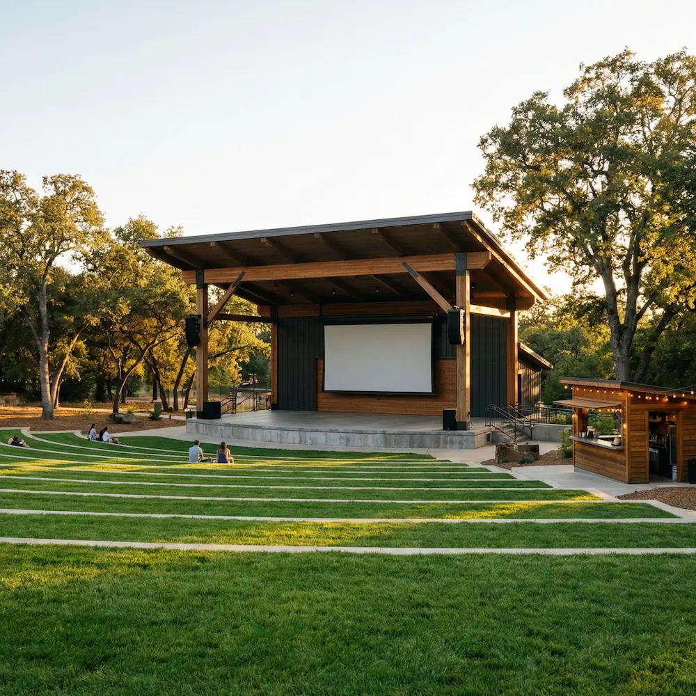
Main Street Park Amphitheater
Laughville, United States

Shakytown Comedy Club
Shakytown, United States
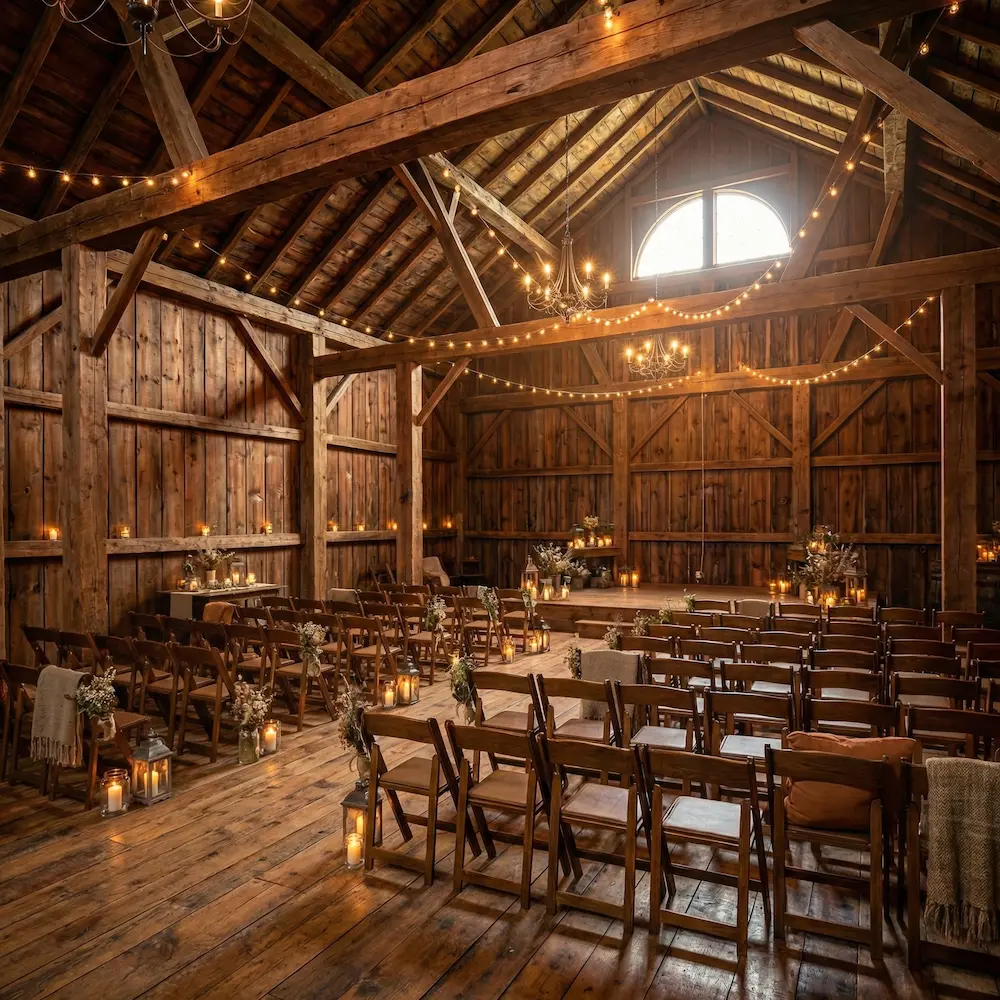
Oak Ridge Barn
Hee-Haw City, Canada
import { venueTypes, venues } from '@/lib/data/venues';import { Badge, Card, Description, Inline, Stack, Text, Tiles, Title,} from '@marigold/components';const featured = venues.slice(0, 3);export default () => ( <Tiles space="regular" tilesWidth="240px" stretch> {featured.map(venue => ( <Card key={venue.id}> <Card.Media> <img src={venue.image} alt={venue.name} className="h-40 w-full object-cover" /> </Card.Media> <Card.Header> <Title>{venue.name}</Title> <Description> {venue.city}, {venue.country} </Description> </Card.Header> <Card.Content> <Stack space="tight"> <Inline space="related"> <Badge variant="info">{venueTypes[venue.type]}</Badge> </Inline> <Text variant="muted"> Up to {venue.capacity.toLocaleString()} guests </Text> </Stack> </Card.Content> <Card.Footer> <Inline space="related" alignY="center"> <Text size="sm" weight="bold"> ${venue.price.from.toLocaleString()} </Text> </Inline> </Card.Footer> </Card> ))} </Tiles>);The same shape works for any repeating content, like team directories with avatars, article previews with author metadata, or category pickers with no media at all. The identity-per-card pattern stays the same. Only the contents of each slot change.
Media
<Card.Media> is optional. Whether to include an image depends on whether the visual carries information.
Use an image preview when each item has its own visual identity, like an event poster, a venue photo, or a product hero. The image is part of how users recognize and choose between cards in a grid.
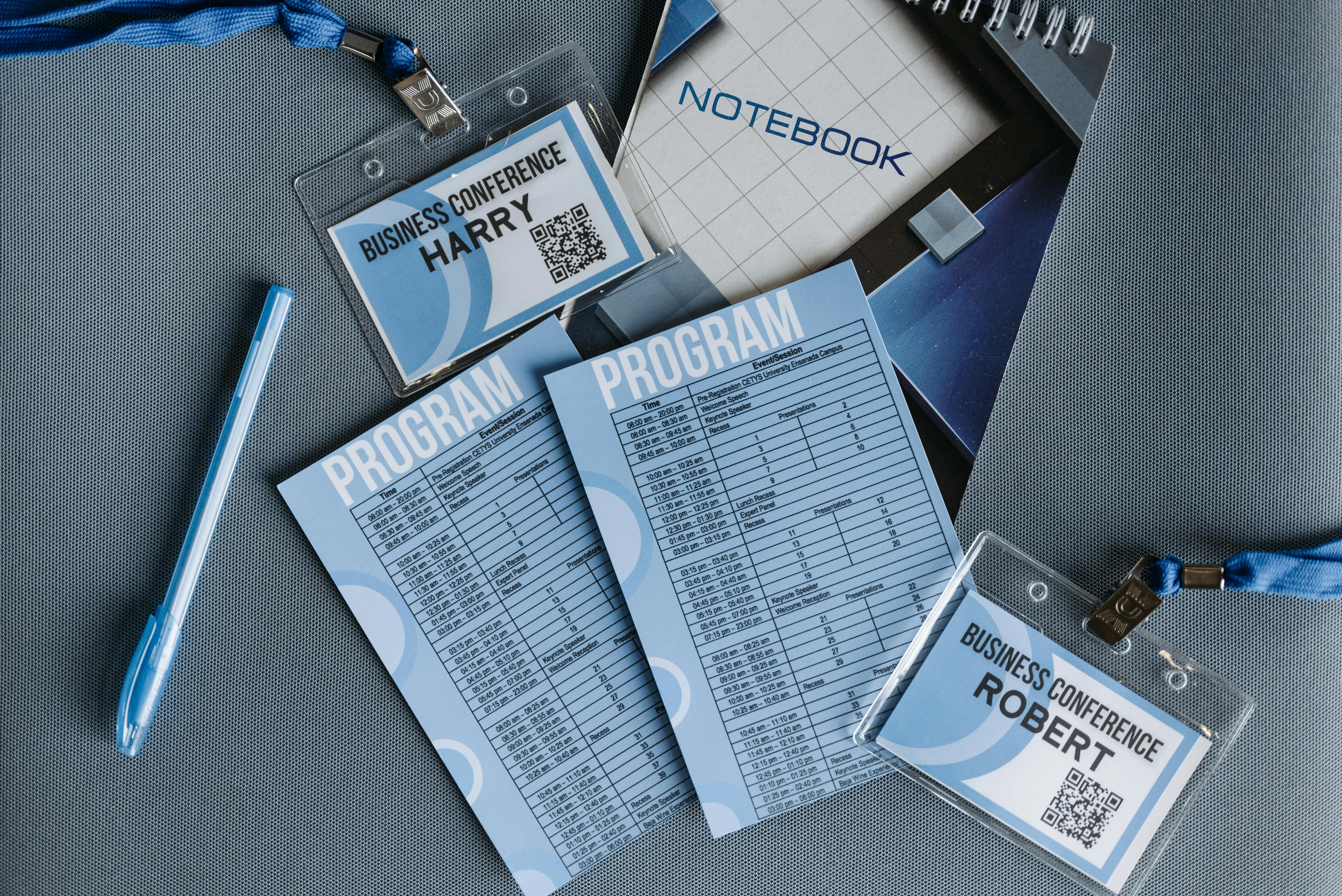
Annual Conference 2025
Our flagship annual event.
import { Badge, Button, Card, Description, Inline, Stack, Text, Title,} from '@marigold/components';export default () => ( <Card> <Card.Media> <img src="https://images.pexels.com/photos/8761744/pexels-photo-8761744.jpeg" alt="Annual Conference 2025" className="h-60 w-full" /> </Card.Media> <Card.Header> <Title>Annual Conference 2025</Title> <Description>Our flagship annual event.</Description> </Card.Header> <Card.Content> <Stack space="tight"> <Inline space="related"> <Badge variant="info">Music</Badge> <Badge variant="success">Tickets available</Badge> </Inline> <Text variant="muted"> Join us for a day of inspiring talks, workshops, and networking. </Text> </Stack> </Card.Content> <Card.Footer> <Button variant="ghost" size="small"> Get tickets </Button> </Card.Footer> </Card>);Do
Put images in <Card.Media> so they sit full-bleed at the top of the card.
Don't
Don't nest the card's main visual inside Card.Content. The padding cuts the
image off from the card's edges and the framing falls apart.
Drop <Card.Media> when the content is text-driven, like a plan summary, a status block, or a quick stat with actions. A title and short body carry the meaning, and a generic stock image only adds noise without helping users decide.
Pro plan
Renews on June 1, 2026.
import { Badge, Button, Card, Description, Inline, Text, Title,} from '@marigold/components';export default () => ( <Card> <Card.Header> <Title>Pro plan</Title> <Description>Renews on June 1, 2026.</Description> </Card.Header> <Card.Content> <Inline space="tight" alignY="center"> <Badge variant="success">Current</Badge> <Text variant="muted"> Unlimited events, custom branding, and priority support. </Text> </Inline> </Card.Content> <Card.Footer> <Button variant="ghost" size="small"> Manage plan </Button> </Card.Footer> </Card>);Footer actions
Put actions in <Card.Footer> when users should be able to act on the item directly from the grid, without opening a detail page.
Use small buttons (<Button size="small" />). Cards sit in tight grid cells, and small buttons match the scale of the surrounding content. Reserve default-size buttons for page-level actions outside of cards.
Nested cards
Cards already sit on a raised surface. Nesting a card inside another card creates double elevation that no longer reads as depth. It's just a frame inside a frame. Restructure the inner content with a layout primitive like <Stack>, a <Divider>, or split the content into sibling sections.
Spacing and padding
Card controls two kinds of spacing, the padding applied to its slots, and the gap between slots. The defaults suit most card layouts. Reach for the overrides when a card is unusually dense or unusually roomy.
Padding
Every slot is inset with p="square-regular", mirroring Panel. Use square-loose for cards that hold long prose or stand alone on the page, and px/py to control the axes separately when uniform padding feels off.
<Card p="square-loose">…</Card>
<Card px="padding-relaxed" py="padding-snug">…</Card>
Slot gap
space controls the vertical gap between Media, Header, Content, and Footer. Default regular works almost everywhere. Drop to tight when the slots should read as one dense surface, or step up to group when the card carries several distinct blocks that need more breathing room.
<Card space="tight">…</Card>
<Card space="group">…</Card>
Bleed
<Card.Content> and <Card.Footer> accept a bleed prop that skips the card's horizontal padding for that slot. Use it for tables, media, or full-width action bars that should reach the card's edges.
<Card>
  <Card.Header>
    <Title>Pricing</Title>
  </Card.Header>
  <Card.Content bleed>
    <Table>…</Table>
  </Card.Content>
</Card>
Accessibility
Card renders an <article> and wires up its accessible name and heading level, so most of the work is handled for you. Give every card a name, pick the heading level that fits the page, and add list semantics when cards repeat in a grid.
Labeling
<Card> renders an <article> landmark. When a <Title> is present, the article is automatically labelled by it (aria-labelledby). Otherwise pass aria-label on the <Card> to give it an accessible name.
Always give a card a name. A <Card> with neither a <Title> nor an aria-label produces an unnamed article landmark, which screen reader users cannot identify. In development, Card logs a console.warn when both are missing.
Heading levels
The card's heading level comes from the headingLevel prop on <Card> (default 3). The default assumes a card grid living under a section-level <h2>, so a card title at <h3> keeps the document outline clean: page heading, then section heading, then card title.
If the grid sits deeper in the page, inside a <Tabs> panel or a <Panel headingLevel={3}>, step the card title down with <Card headingLevel={4}> so the outline still nests correctly.
Collection semantics
A card rarely appears alone. The canonical use is a grid of cards, and a repeating collection is semantically a list. Because <Tiles> accepts a role and an aria-label, mark the grid as a list and wrap each card in an element with role="listitem". Assistive technology then announces the item count and lets the user step through the set:
<Tiles
  role="list"
  aria-label="Venues"
  space="regular"
  tilesWidth="240px"
  stretch
>
  {venues.map(venue => (
    <div role="listitem" key={venue.id}>
      <Card>…</Card>
    </div>
  ))}
</Tiles>
The roles are set explicitly rather than on native <ul> and <li> tags. A <ul> styled as a grid usually carries list-style: none, and in Safari that removes the list's semantics. An explicit role="list" on the <Tiles> grid is not affected, so the list markup holds. Since <Card> is not polymorphic today, the list structure lives on the wrapper, not on the card. The card grid demo earlier on this page shows the per-card composition. Wrap that grid as shown here to add the collection semantics.
Props
Card
Prop
Type
Accessibility props (54)
Prop
Type
DOM event handlers (164)
Prop
Type
Card.Media
Prop
Type
Card.Header
Prop
Type
Card.Content
Prop
Type
Card.Footer
Alternative components
When your content isn't a good fit for a card, one of these is usually the right answer.
Another Collection component
<Table>: The other Collection component. Reach for it when items share the same fields and the task is comparison, sorting, or bulk action.
When the content isn't a collection
<Panel>: A unique, named page region like "Billing" or "Team members".<Stack>: Content that shares a topic but has no per-item identity.<Tiles>: A reflowing grid of layout blocks rather than collection items.<List>: A simple ordered or unordered list of items.
When cards are selectable options
<SelectList>: Card-shaped options the user selects in a form, with selection state and keyboard support built in.