DatePicker
Component used to pick date value.
The <DatePicker> component is a user interface element that allows users to select a date from a calendar.
The typical practice is to provide a date picker and when you click on calendar button it pops up a calendar below the date field, allowing the user to populate the field with an appropriate date.
Anatomy
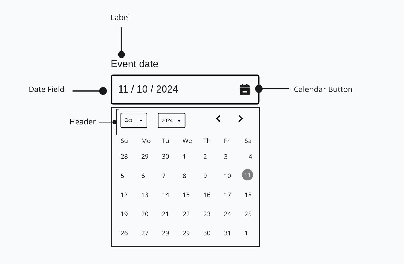
The Label defines the purpose of the Date Field, where users can enter a date directly. Tapping the Calendar Button opens a calendar view with a Header for selecting the month and year, and Next/Previous Buttons for easy month navigation.
Appearance
The appearance of a component can be customized using the variant and size props. These props adjust the visual style and dimensions of the component, available values are based on the active theme.
| Property | Type | Description |
|---|---|---|
variant | - | The available variants of this component. |
size | - | The available sizes of this component. |
Usage
<DatePicker> is used when you need users to select a date accurately, like for booking events, scheduling appointments, or setting deadlines. It's ideal when date formats might vary, as it standardizes input and reduces mistakes because its visual clarity, format consistency and accuracy. DatePickers are also helpful when users might need guidance on valid date ranges, like selecting only future dates for reservations. Avoid using it for casual date entries where a simple text field would suffice.
Basic Usage (uncontrolled)
This example shows a regular <DatePicker> without any special props.
import { DatePicker } from '@marigold/components';export default () => <DatePicker label="Date" />;Min/Max Values
The minValue and maxValue props are used to perform built-in validation. This prevents the user from selecting dates outside the valid range in the calendar .
import { CalendarDate } from '@internationalized/date';import { DatePicker } from '@marigold/components';export default () => ( <DatePicker label="Event Date" description="Choose a date for your ticket purchase. Dates must be between June 5, 2025, and June 20, 2025." minValue={new CalendarDate(2025, 6, 5)} maxValue={new CalendarDate(2025, 6, 20)} />);Controlled
The value and onChange props can be used to control the DatePicker.
Current Selected Date: Day: 29 Month: 10 Year: 2023
import type { DateValue } from '@internationalized/date';import { parseDate } from '@internationalized/date';import { useState } from 'react';import { DatePicker, Stack } from '@marigold/components';export default () => { const [value, setValue] = useState<DateValue>(parseDate('2023-10-29')); return ( <Stack space={3}> <DatePicker label="Ticket Date" value={value} onChange={newValue => setValue(newValue!)} /> <pre> <strong>Current Selected Date: </strong> {`Day: ${value.day} Month: ${value.month} Year: ${value.year}`} </pre> </Stack> );};Using a Date Object
When using a datepicker, relying on the standard JavaScript Date object for its value can result in timezone inconsistencies and incorrect date display. That's why the datepicker uses a specific DateValue type from @internationalized/date instead. This library handles correct international date manipulation across calendars, time zones, and other localization concerns.
@internationalized/date
@internationalized/date is a peer dependency. If it's not already in your
project, you'll need to install it.
The simplest way to parse a Date for the datepicker is by using parseAbsoluteToLocal. This function converts an absolute date and time into the current user's local time zone.
If you're already using a date library like date-fns, you can also utilizing parseDate. Ensure that you only pass the date part to parseDate, excluding the time and timezone information.
import type { DateValue } from '@internationalized/date';import { parseAbsoluteToLocal } from '@internationalized/date';import { useState } from 'react';import { DatePicker } from '@marigold/components';export default () => { const date = new Date().toISOString(); const [value, setValue] = useState<DateValue>(parseAbsoluteToLocal(date)!); return ( <DatePicker label="Date" value={value} onChange={newValue => setValue(newValue!)} /> );};Paste Support
The <DatePicker> supports pasting date values from the clipboard. Users can copy dates in common formats and paste them directly into the date picker field. The component automatically parses and validates the pasted content.
Supported date formats:
- ISO format:
2023-12-25 - European format:
25.12.2023or25/12/2023 - US format:
12/25/2023or12-25-2023
Invalid dates or unrecognized formats are ignored, ensuring data integrity.
import { DatePicker, Stack, Text } from '@marigold/components';export default function () { return ( <Stack space={4}> <Text size="small" variant="info"> Try pasting a date in yyyy-mm-dd format (e.g., "2025-09-24") </Text> <DatePicker label="Scheduled Date" description="You can paste dates directly into this field" /> </Stack> );}Quick select presets
Use the presets prop to offer common dates as a one-click list beside the calendar in the popover, such as "Today" or "Tomorrow" for a due date. Built-in keys ship with localized labels and correct date math, and custom presets take a label plus a date value or a resolver function. Presets that fall outside minValue/maxValue or land on an unavailable date are disabled.
DatePicker accepts the single-date built-ins: today, yesterday and tomorrow. Range keys such as this-week or last-30-days are only available on DateRangePicker and RangeCalendar, where a preset selects a range instead of a single day.
For custom presets, pass value as a function when the date is relative to now (for example "In two weeks"), so it resolves at selection time instead of when the view first rendered. A plain value is right for fixed dates. If you provide several custom presets, give each a unique id: it defaults to the label, so two presets sharing a label would collide.
import { DatePicker } from '@marigold/components';export default () => ( <DatePicker label="Event date" presets={['today', 'tomorrow']} // [!code highlight] />);Quick select on narrow screens
The picker's overlay is already a bottom sheet on small screens, so a "Quick selection" row above the grid switches the sheet to the preset list in place, with a Back row to return to the calendar. Picking a preset applies the date and returns to the calendar, and the overlay stays open.
Combine with a second field
A "From" and "To" pair of <DatePicker>s can each carry their own presets. Feed the other field's value into minValue/maxValue so the range stays valid, and pick presets independently for each end.
import type { DateValue } from '@internationalized/date';import { useState } from 'react';import { DatePicker, Stack } from '@marigold/components';export default () => { const [from, setFrom] = useState<DateValue | null>(null); const [to, setTo] = useState<DateValue | null>(null); return ( <Stack space={4}> <DatePicker label="From" value={from} onChange={setFrom} maxValue={to ?? undefined} // [!code highlight] presets={['today', 'tomorrow']} /> <DatePicker label="To" value={to} onChange={setTo} minValue={from ?? undefined} // [!code highlight] presets={['today', 'tomorrow']} /> </Stack> );};Props
DatePicker
Prop
Type
Accessibility props (4)
Prop
Type
DOM event handlers (64)
Prop
Type
Alternative components
DateRangePicker: Pick a start and end date (a range) through a single field.
DateField: Allows users to input a date directly.