Tooltip
Component for displaying short information.
The <Tooltip> component offers users short, contextual hints when they hover or focus on specific UI elements. It displays a hint alongside the referenced element, working together to unobtrusively clarify elements in the interface. It's ideal for brief, passive help that doesn't require interaction or persistent visibility.
Anatomy
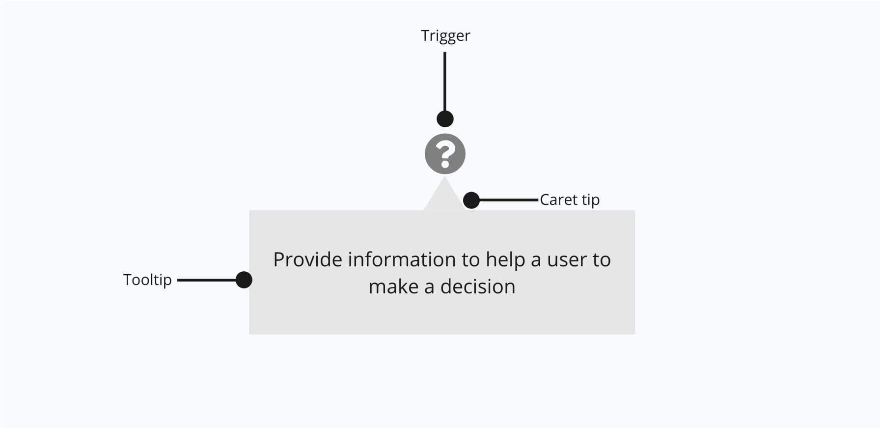
- Trigger: Indicator that can be activated on hover or focus.
- Caret tip: Closely associates the tooltip to term to be defined.
- Tooltip: Holds the informative text or message.
Appearance
The appearance of a component can be customized using the variant and size props. These props adjust the visual style and dimensions of the component, available values are based on the active theme.
| Property | Type | Description |
|---|---|---|
variant | default | white | The available variants of this component. |
size | - | The available sizes of this component. |
The Tooltip component supports different color schemes to match the surrounding context.
| Variant | Description | When to use |
|---|---|---|
default | Dark tooltip with branded background and light text. This is the default variant. | Most cases where a tooltip is needed to provide additional context on hover or focus. |
white | Light tooltip with a subtle border. | When the default dark tooltip would clash with the surrounding UI, or for a softer visual appearance. |
Usage
Tooltips are best used to provide concise, supportive information for UI elements that may need clarification. They should be brief, non-essential, and avoid disrupting the flow of interaction. Use them to explain unfamiliar icons, edge cases, or provide hints that help users without cluttering the interface.
Icons without visible labels can be unclear, especially for less familiar actions. A tooltip offers quick, contextual clarification by revealing the icon's purpose on hover or focus. For example, a tooltip might clarify that an icon represents "Download as PDF" when the label is not visible.
'use client';import { Button, Tooltip } from '@marigold/components';import { DesignTicket } from '@marigold/icons';export default () => ( <Tooltip.Trigger> <Button variant="ghost" size="icon" aria-label="Design Ticket"> <DesignTicket aria-hidden="true" /> </Button> <Tooltip>Design Ticket</Tooltip> </Tooltip.Trigger>);Avoid using tooltips for critical information, long explanations, or interactive content. If users need persistent guidance, longer descriptions, or help while interacting with a task, consider components like contextual help, the help text of a form fields, or a message displayed inline. These patterns are better suited for complex or essential information that should not disappear when the user moves their cursor.
Do
Use tooltips to explain icons without a label or to describe uncommon behavior.
Don't
Don't use tooltips if the information is essential to complete a task.
Show on focus
Tooltips can also appear when an element receives keyboard focus, not just on hover. This ensures that users who navigate via keyboard or assistive technologies receive the same helpful information as mouse users.
Use focus-triggered tooltips to improve accessibility, especially for icon-only buttons, form controls, or compact layouts where context is not visually obvious. It's particularly helpful when the tooltip content clarifies the purpose of an element that lacks a label or descriptive text.
To enable this behavior, set the trigger prop on <Tooltip.Trigger> to "focus".
'use client';import { Button, Tooltip } from '@marigold/components';export default () => ( <Tooltip.Trigger trigger="focus"> <Button>Check Availability</Button> <Tooltip>View available seats before booking.</Tooltip> </Tooltip.Trigger>);Accessibility
You do not need to set aria-describedby manually because the <Tooltip> component sets it for you. However, if the button contains only an image or icon such as an SVG, make sure to provide an aria-label on the button for screen readers, and consider setting aria-hidden="true" on the image to avoid redundant announcements.
Props
Tooltip
Prop
Type
Accessibility props (4)
Prop
Type
DOM event handlers (64)
Prop
Type
Tooltip.Trigger
Prop
Type
Alternative components
- ContextualHelp: Use when users need more detailed, persistent guidance near a specific element or task.
- SectionMessage: Use to highlight important information inline that should remain visible as users read or interact with the page.