TimeField
Component for entering time in forms.
The <TimeField> allows users to enter and edit time values using the keyboard. Each part of the time value, such as hour, minute, and optionally AM/PM, is displayed in an individually editable segment. These segments are focusable and can be incremented or decremented using the arrow keys, or edited by typing. This segmented approach ensures correct formatting and parsing of time values across different locales and hour cycles, and provides a reliable, keyboard-friendly way to input time.
Anatomy
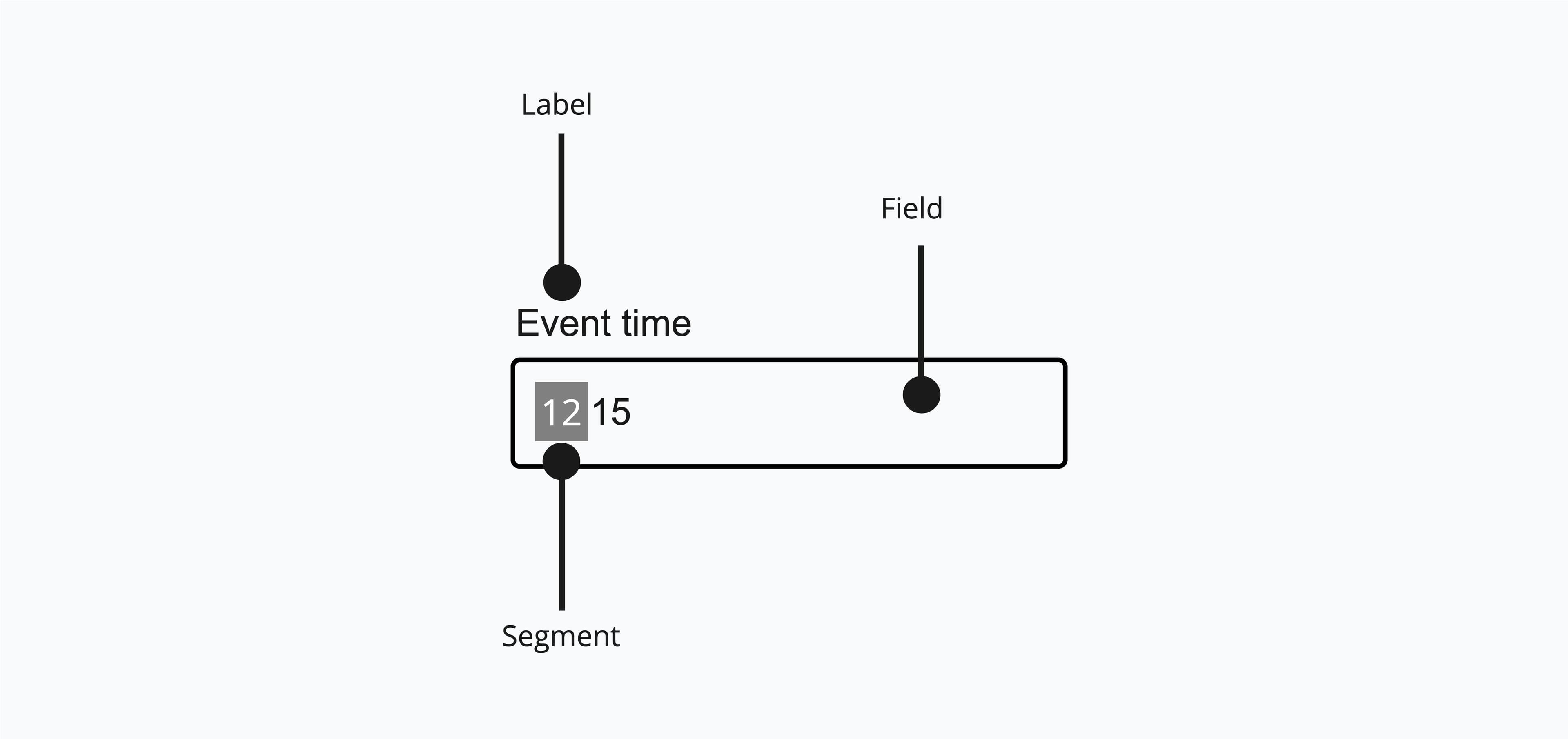
A <TimeField> consists of a label and a group of segments representing each unit of a time, such as hours, minutes and seconds.
Appearance
The appearance of a component can be customized using the variant and size props. These props adjust the visual style and dimensions of the component, available values are based on the active theme.
| Property | Type | Description |
|---|---|---|
variant | - | The available variants of this component. |
size | - | The available sizes of this component. |
Usage
The <TimeField> component is a flexible input element for selecting times within forms. It improves user experience by offering a clear and structured way to enter time values, minimizing errors from manual input. With support for labels, descriptions, and time formatting options like 12- or 24-hour cycles, it communicates its function effectively. The component also allows setting default values and customizing granularity (e.g., hours, minutes, seconds). This makes the <TimeField> ideal for applications that require accurate and accessible time selection.
Min/Max Values
The minValue and maxValue props are used to perform built-in validation. This prevents the user from choosing times outside the valid range.
import { parseTime } from '@internationalized/date';import { TimeField, TimeFieldProps } from '@marigold/components';export default (props: TimeFieldProps) => ( <TimeField minValue={parseTime('09:00')} maxValue={parseTime('17:00')} label="Pick a time" description="Time must be during office hours form 09:00 - 17:00" defaultValue={parseTime('12:00')} {...props} />);Props
TimeField
Prop
Type
Accessibility props (4)
Prop
Type
DOM event handlers (64)
Prop
Type